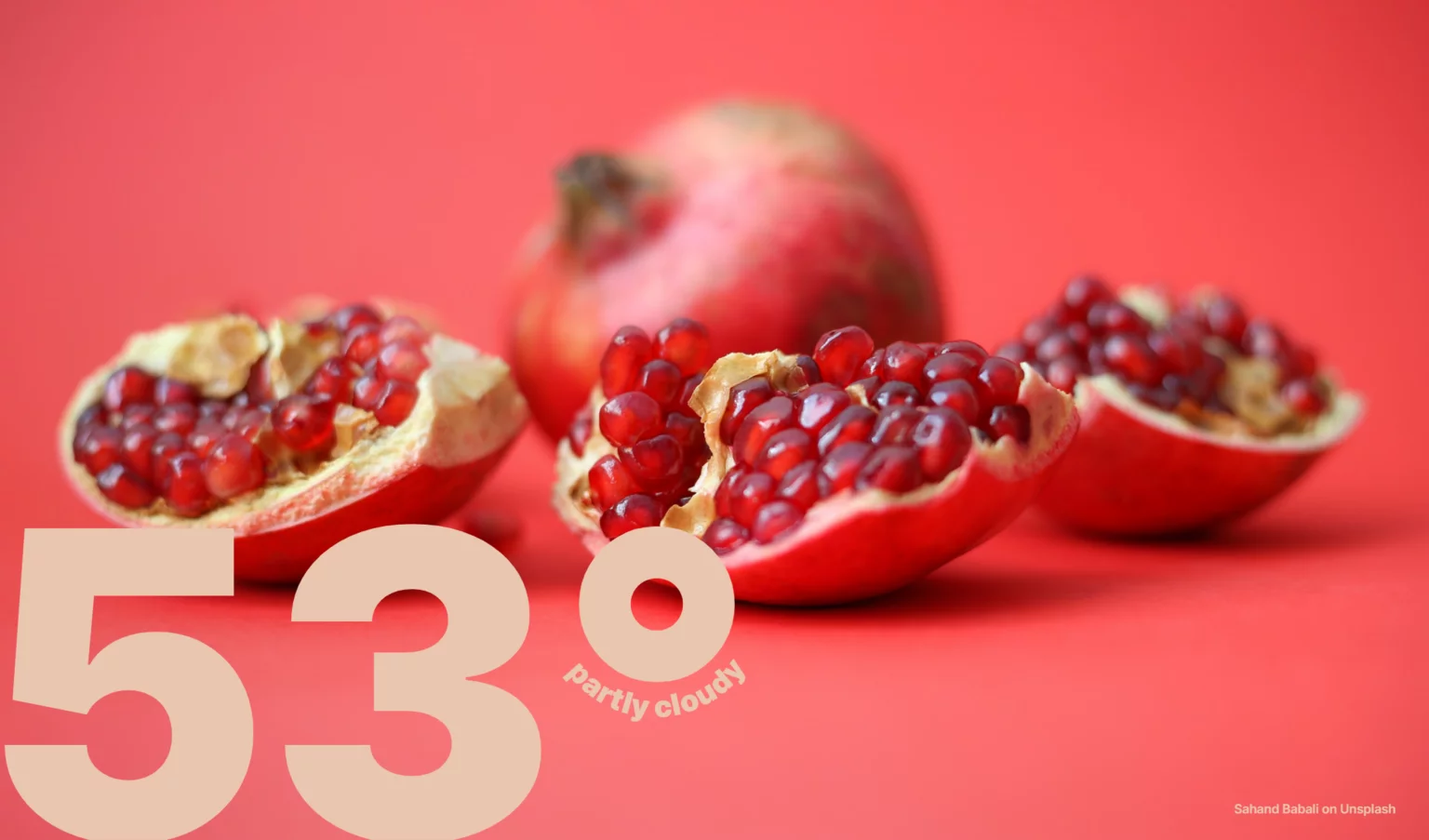
In Temperate’s latest update, there’s now the option to replace a solid colored background with an image that changes daily. They’re pulled from Unsplash each day at midnight by my backend server.
Unfortunately, sometimes the image of the day happens to be particularly close to the color of the temperature reading, which can make it hard to read. Instead of having the user constantly change their color settings to match the new image, I wanted the process to be automated by the server.
What exactly makes a good choice of color?
Now to get the most contrast, we could try choosing a color that’s complementary to the main color of the image. Let’s see what that looks like.
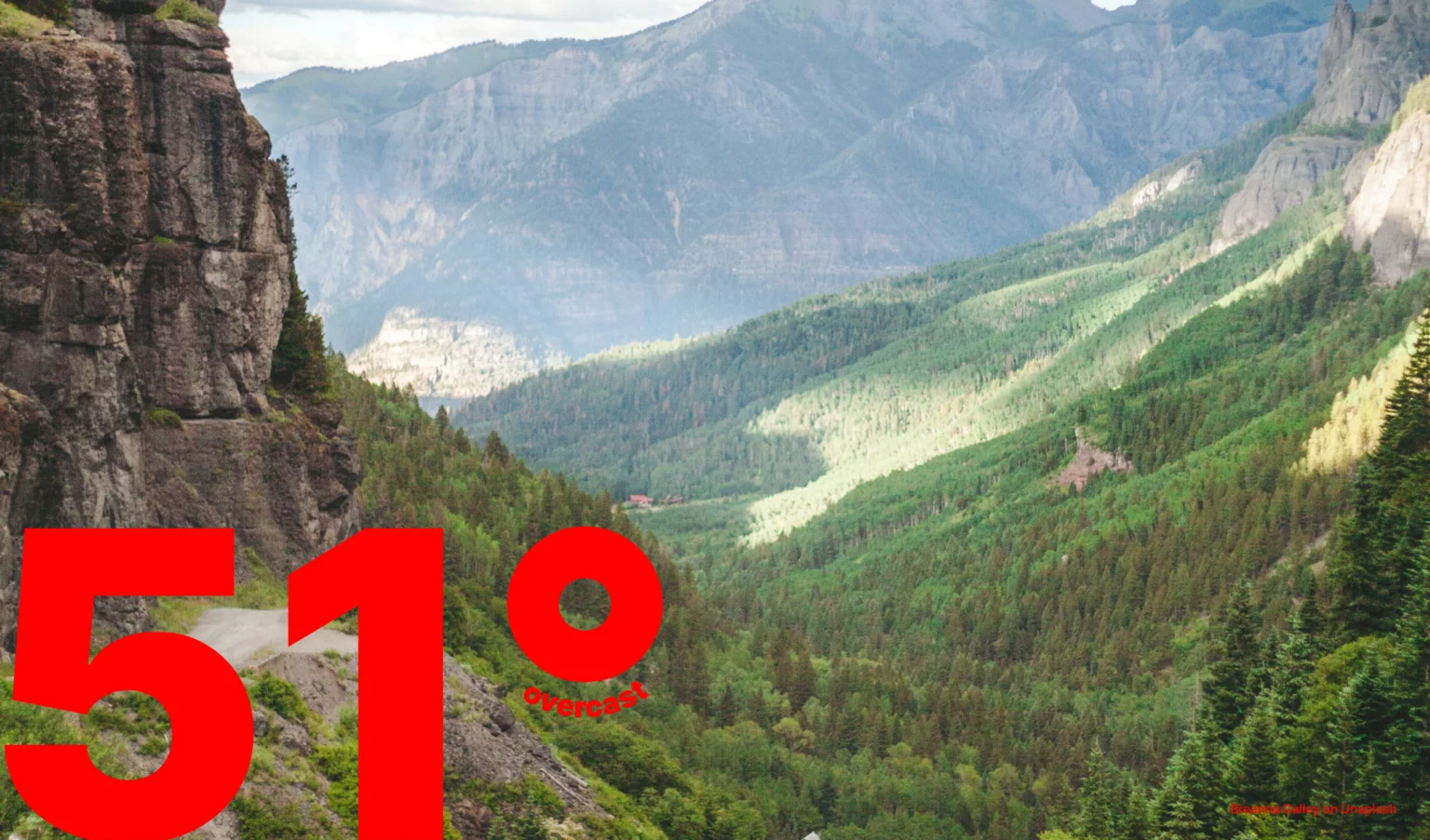
It’s readable now, but not very attractive. Complementary colors tend to vibrate against each other.
Our challenge is come up with a text color that provides enough contrast with the image, but is also pleasing to the eye.
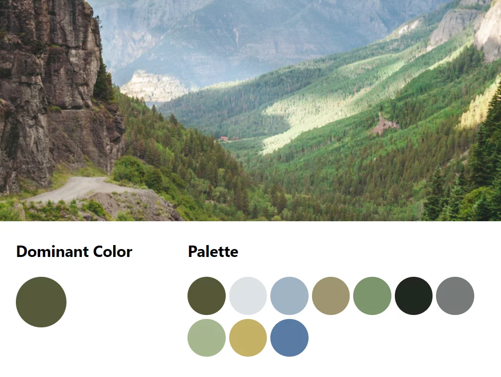
Step 1: Get the color palette of the image
If we want the text to look good on top of the image, we should try to choose a color that’s already present in the image, so we start by getting the image’s palette.
Luckily, we don’t have to dive into exactly how that’s done. The color-thief module makes it pretty easy. For our purposes, getting the top 10 colors should be more than enough. Here’s what that looks like for our example image.
Step 2: Check the contrast with each color
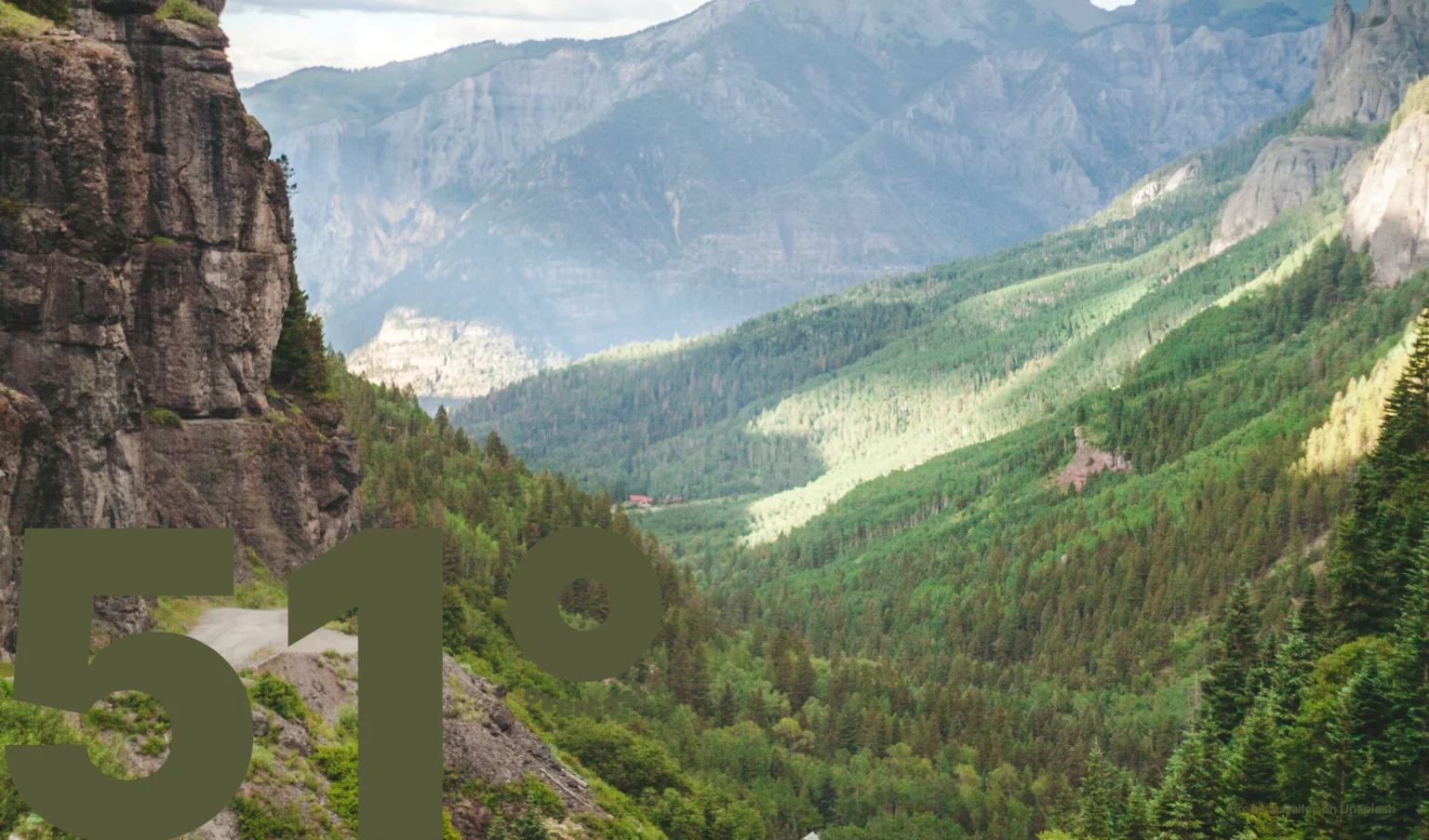
The problem is that now, if we choose the most dominant color, our temperature’s gonna be pretty hard to read.
At this point, we wanna try each palette color against the image and choose the best one. To do that, we need a way to get the contrast between the text and the background. Quantifying this difference isn’t a new problem in the web accessibility space. We’ll use the WCAG 2 standard.
Step 3: Divide up the image
Unfortunately, getting a single color that represents the background isn’t easy. To start, we want to isolate the part of the image that the text will appear on top of. In this case, that’s the bottom-left corner.
Averaging the color in this area seems like the obvious move, but for images with lots variance in value, this won’t work. For example, a checkerboard’s average color is gray. Given a gray background, both black and white seem like reasonable text colors, but both would be impossible to read on top of a checkerboard.
We need to consider the image in smaller chunks that we can get the average color of. Let’s see what that looks like.
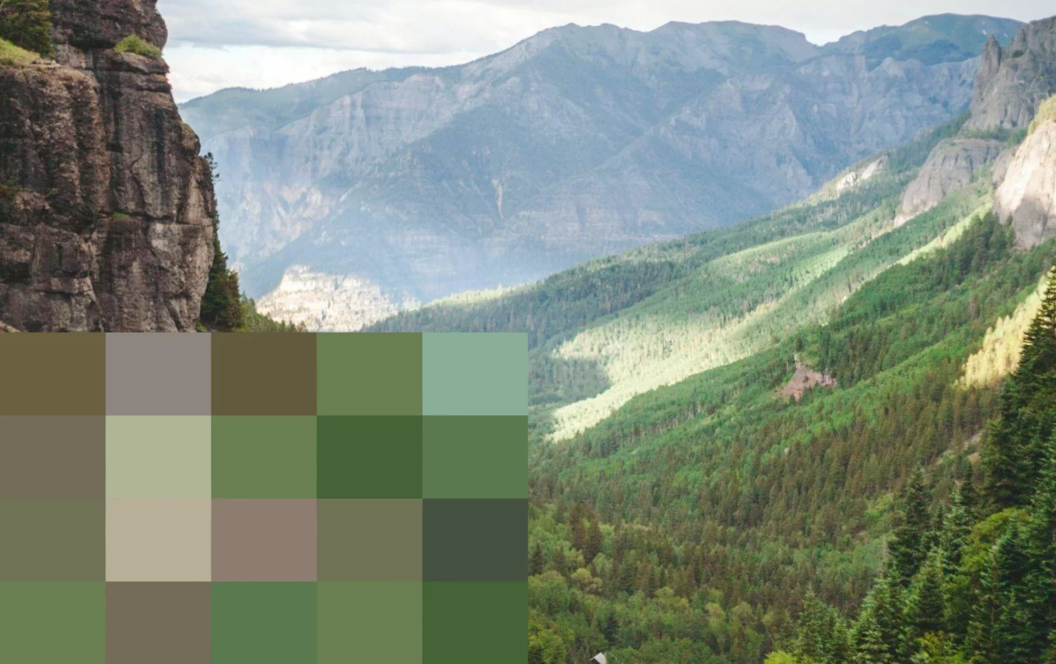
Now we’re ready to start comparing colors. We can go through each square and get the contrast ratio between it and a potential text color using the module we talked about earlier. We’ll treat the average of these contrast ratios as the contrast ratio between the text and the image.
Once we’ve gone through each of the colors from the palette, we can choose the one with the highest ratio to be the text color.
Step 4: Make some final adjustments At this point, we know that our candidate color is both present in the image, and provides enough contrast to the background. Sadly, sometimes the color is still ugly. This last part is just to cap the saturation of the text color to a maximum value of 65%. This just brings it slightly closer to gray if necessary.
Our process ended up choosing #DCE1E4, which looks like this:
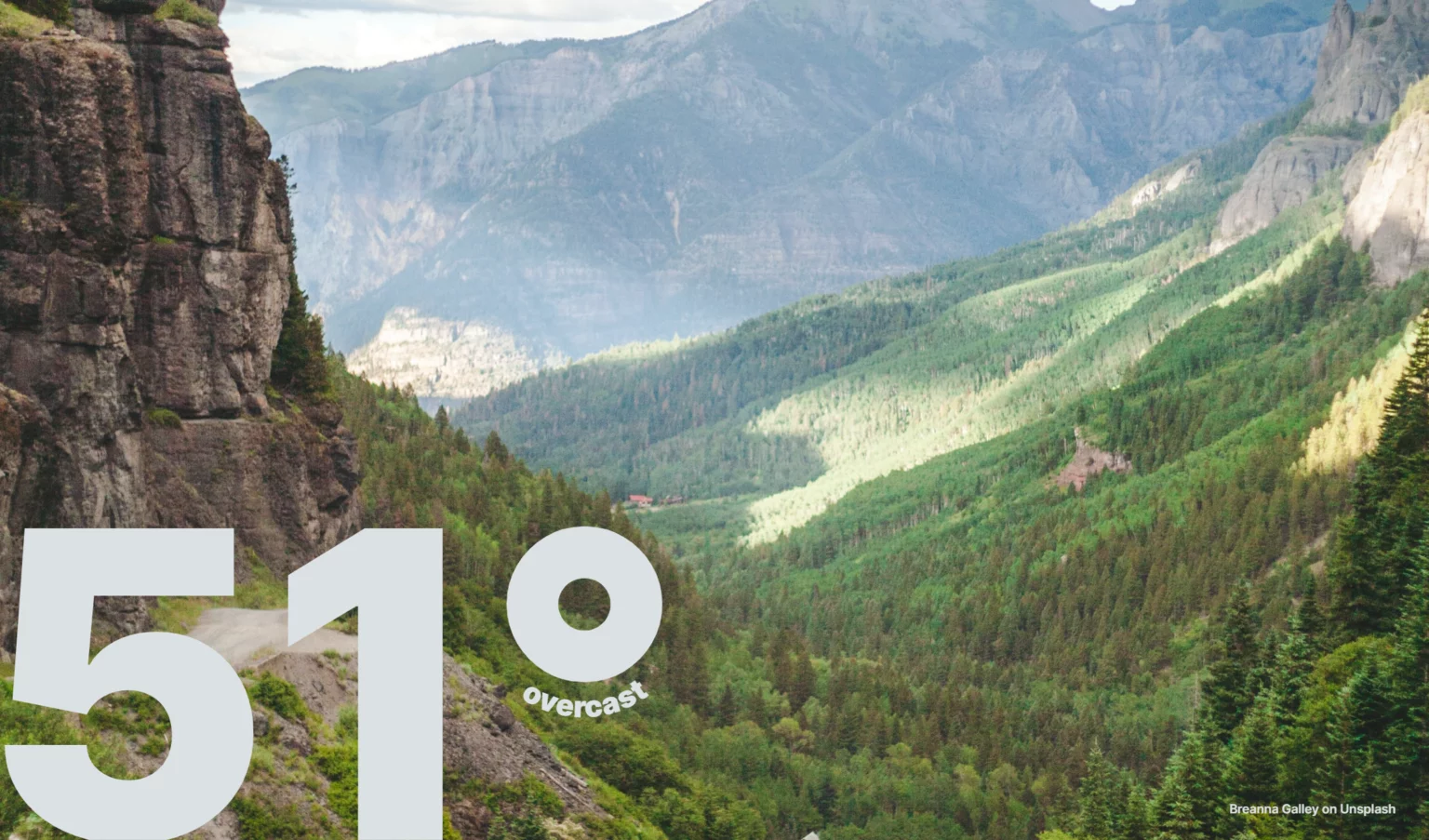
Finally! The backend stores this color and serves it when a daily image is requested. If the option is enabled in a user’s settings, their temperature color will be replaced with the auto-generated one.
Now it isn’t perfect, so I do still check on what it’s come up with from time to time and switch out images or colors as I see fit, but it rarely needs correction.